Ok folks, let's get to those toy photography techniques and workflows I said I’d share to help you Take Better Toy Photos. Let’s start with my second concept of the year: the street party bard.
(I'm upping the frequency of this newsletter with these Behind the Photo series so say hello to the semi-monthly TBTP newsletter! Monthly TBTP, we hardly knew ye.)
Ideation
My toy photography workflow usually starts with creating a completely custom character. But this time, I simply wanted to outfit the troubadour from CMF Series 22 with a custom hat I just got.
That plus a new cape from the latest CMF Series: character done. It’s far from my most original character but I wanted to see how well that custom hat fit.
Coming up with a story is a challenge for me, which is why I have a lot of environmental portraits in my portfolio. But for the past few months, I've been intentionally making a bigger effort with storytelling. I’m not 100% sure I enjoy it though, to be perfectly honest.
I don’t know. Maybe I’m more in the Winogrand camp:
I don't have anything to say in any picture. My only interest in photography is to see what something looks like as a photograph.
I’ll talk about that in another newsletter though. I have opinions.
At this point, I just play with poses and imagine if my character should be jumping in the air, sitting on a windowsill, coming out of a door, or whatever. I ended up carefully leaning the bard by barely attaching his foot to a LEGO plate. Then left it on my desk for the next day.
In the morning, I got a couple of congratulatory emails from Substack and Google for hitting milestones on my newsletter and website. (Thanks for subscribing!)
Here was the inspiration for a photo: a small announcement and celebration. And I conveniently had just the character for the job, still perfectly balanced on my desk ready to sing the news out loud.
I just needed to swap his head for one with a more ecstatic expression and dress up my brick-built set a little for the party.
Setup
This celebratory scene was going to be shot in Galen’s Row, my medieval alley MOC that is basically facades that can be connected together. It’s not your average dreary, run-down model though; it’s got quite a bit of color in it.
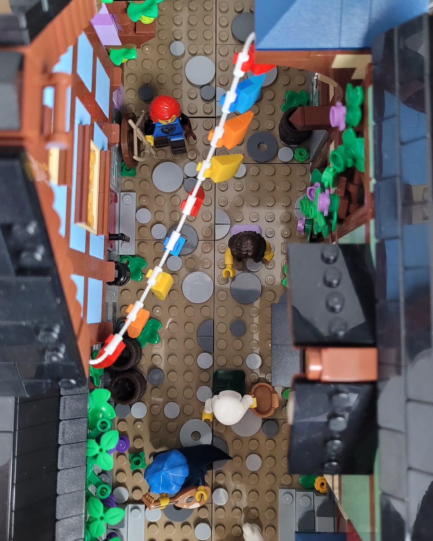
But to make it more festive, I quickly assembled a simple string of colorful party banners and put that inside diagonally.
I wanted the line of banners to come from the back and lead to the grapes above the bard’s head. A “leading line” like this is a basic composition technique where you use a line to draw the viewer’s attention to something.
The grapevines are my favorite detail in Galen’s Row and that’s also why I chose this section of the MOC to place the bard.
At this point, I brought in my camera to check how everything looked through the lens. I saw that by turning the whole model a little bit, I could create more space to the right of the bard where I could add more medieval characters for a busier street scene.
While looking at the camera screen, I carefully placed each new minifig and object (like the chickens). I've learned to add details incrementally and only while checking the LCD screen: it’s easy to go overboard and mess up compositions if you just eyeball it.
Your camera body and lens choices determine a good part of how the camera renders an image in 2D, and that’s often very different from what we see with our eyes in 3D.
That’s why it makes more sense to “build to the camera” rather than building for what you see with your eyes first and then looking through the camera. (That’s why it’s tough to shoot official LEGO sets, by the way.)
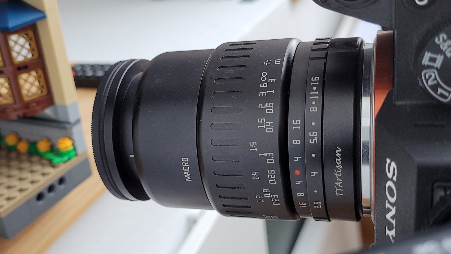
My choice of lens and camera body was to use the TTArtisan 40mm macro lens with my Sony a7iii body.
I usually shoot with a Sony 30mm macro lens in Galen’s Row and other narrow brick-built MOCs to make them appear more expansive. But using the 40mm would make the minifigures look like they were closer together, which is what I wanted. A 10mm difference in focal length can be a big deal.
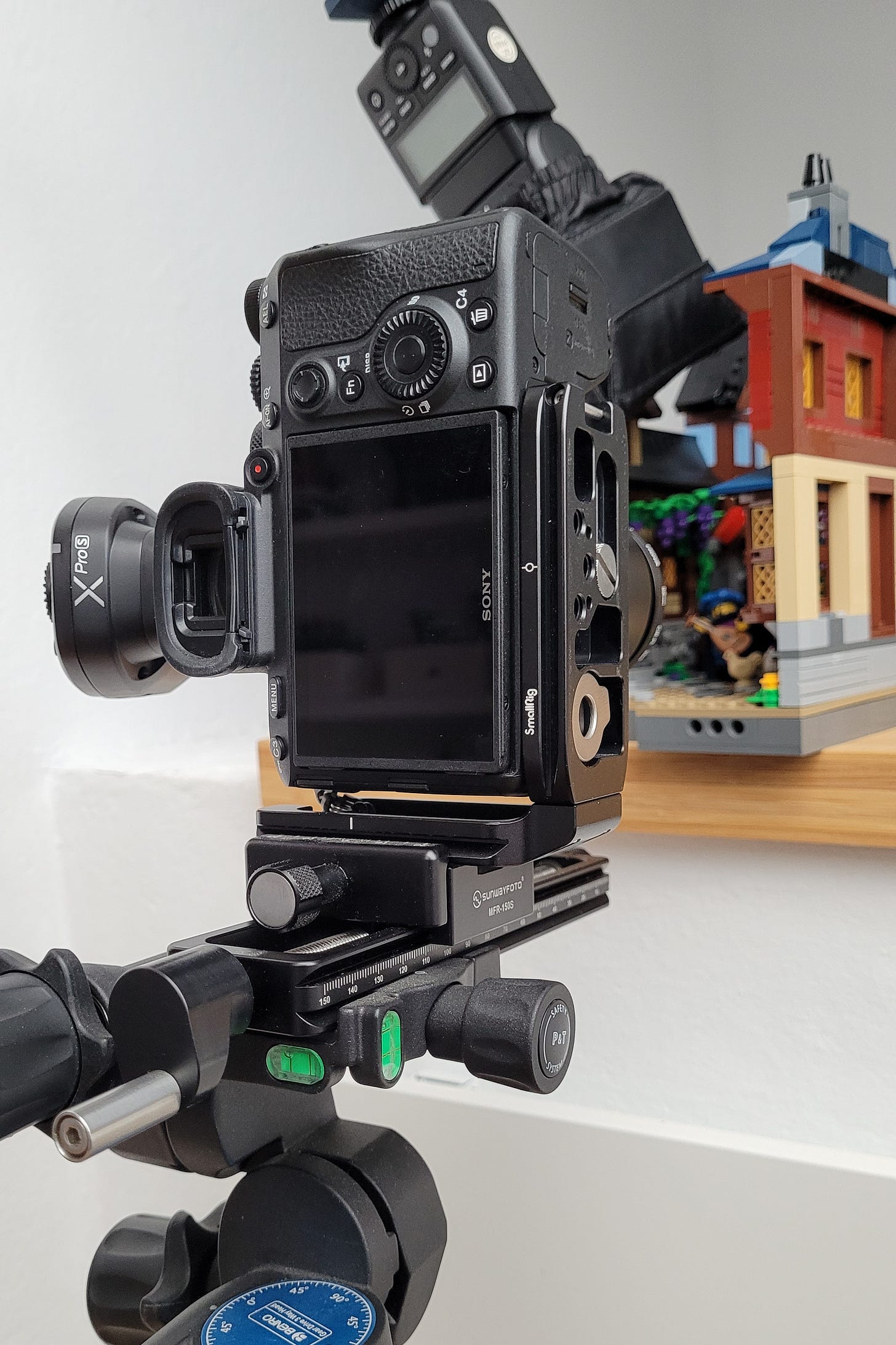
I also had my camera positioned vertically on my tripod using an L-bracket because a portrait orientation is the best choice for these narrow builds.
L-brackets are great because you can quickly orient the camera and keep the center of gravity the same. You don’t have to rotate or flip the camera to the side of the tripod.
To recap my main composition choices:
portrait orientation because the banners strung over the street are important and the MOC is narrow
leading lines with the banners pointing to the grapes and the bard
trio of street figures placed in the empty space opposite where the bard is leaning so they can be seen but aren’t distracting
foreground interest with the chickens
Lighting
I love lighting! It’s my favorite part of shooting.
I had 3 flashes set up outside Galen’s Row: a standard flash on a lightstand, a mini flash (partially obscured by the lightstand), and a small flash with a small softbox on articulating arms mounted to the wall.
I “build up the light” which means I set up light sources one at a time. It’s much easier to do this than to have all the lights firing at the same time and trying to guess which light source is affecting what part of the scene.
Here’s how I built up the light, starting with a shot with the ambient light on the left, the background light next, then the backlighting, and finally the main light.
(I have a short video of this on YouTube.)
Ambient light seen at f/4 to isolate the bard in the busy street, and then shutter speed slowed down until I just started to see some shapes. I only wanted some legibility with the ambient light, not a completely black frame.
Light the angled castle wall with the mini flash to illuminate the background and separate the minifigs from it.
Backlight the subjects with the standard flash on the lightstand. I like the direction of this light because it creates highlights around the minifigures’ shapes and doesn’t give me problems with reflections on the faces.
Light the bard frontally with the small flash in a small softbox at low power.
Editing
I don’t tend to do much to my photos in post-processing unless I have supports I need to remove or I need to focus stack so generally, my edits are done entirely in Lightroom.
The left photo is the unedited image and the right is the edited one. You might not be able to see the differences because they are so subtle, so I’ll point them out:
The brightness of the foreground was pulling my eye towards it so I brought the exposure down with a linear gradient.
I wanted a little more focus on the bard’s face so I increased the exposure with a radial gradient.
I also slightly lifted the overall exposure using a curves adjustment.
(I also have a short video on YouTube about the editing process.)
And that's how I got the shot.
LEGO Art Book Giveaway
I’m giving one lucky TBTP newsletter subscriber a pair of LEGO art books: LEGO In Focus and The Art of the Minifigure!
LEGO In Focus is the first official LEGO toy photography book. I worked on it as a collaborator and contributor so when I say that this is a fine addition to your art or coffee table book collection, I am entirely biased.
The Art of the Minifigure is a visual history of my favorite toy photography subject. It’s got concept art, interviews with designers, and all that good stuff.
Here’s how I’m going to run the giveaway:
All Take Better Toy Photos newsletter subscribers are entered into the giveaway.
One newsletter subscriber will be randomly selected on February 5, 2023.
I’ll notify winners via the email they use to receive Take Better Toy Photos.
Winners will have 48 hours to confirm receipt of the notification email.
If the winner doesn’t respond within 48 hours, I’ll select another winner at random.
There is a bit of fine print: the physical books can only be shipped to Europe, UK, and North America only at this time. Shipping is free, but if taxes or customs are due in your country, that’s your responsibility.
Toy Photography Features
The bard is one of my favorite characters from CMF Series 22, and I know it was a LEGO fan favorite as well.
The LEGO photography community has taken him on some pretty cool adventures:
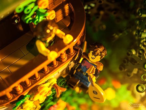
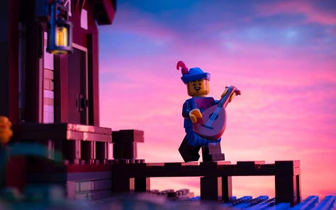
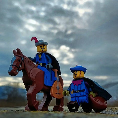
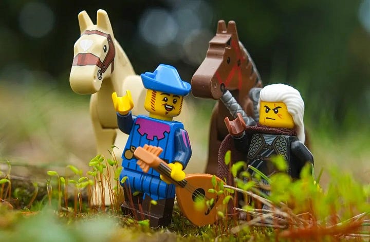

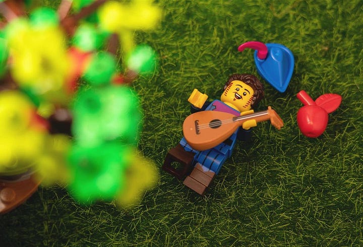

Credits: retza.photobricks, metarix_studios, the.great.battle, tomekskog, thebrickdwarf, angeljtakesphotos and tobiarts.and.design




Thanks for interesting writing! I appreciate the articles with “how” and especially “why”! Spent few minutes to spot the difference between raw and edited images.
Excellent post! As someone who struggles to come up with stories for each photo, I feel that the Winogrand quote describes me perfectly! I'm curious to see your upcoming post on that topic.
I'd also love to see some tips on how to use foreground elements. I feel like every time I put something in the foreground it looks like an out of focus blob and I usually remove it :-)