Why bad photos are popular on social media
Answering the "how did that get more likes than mine" question
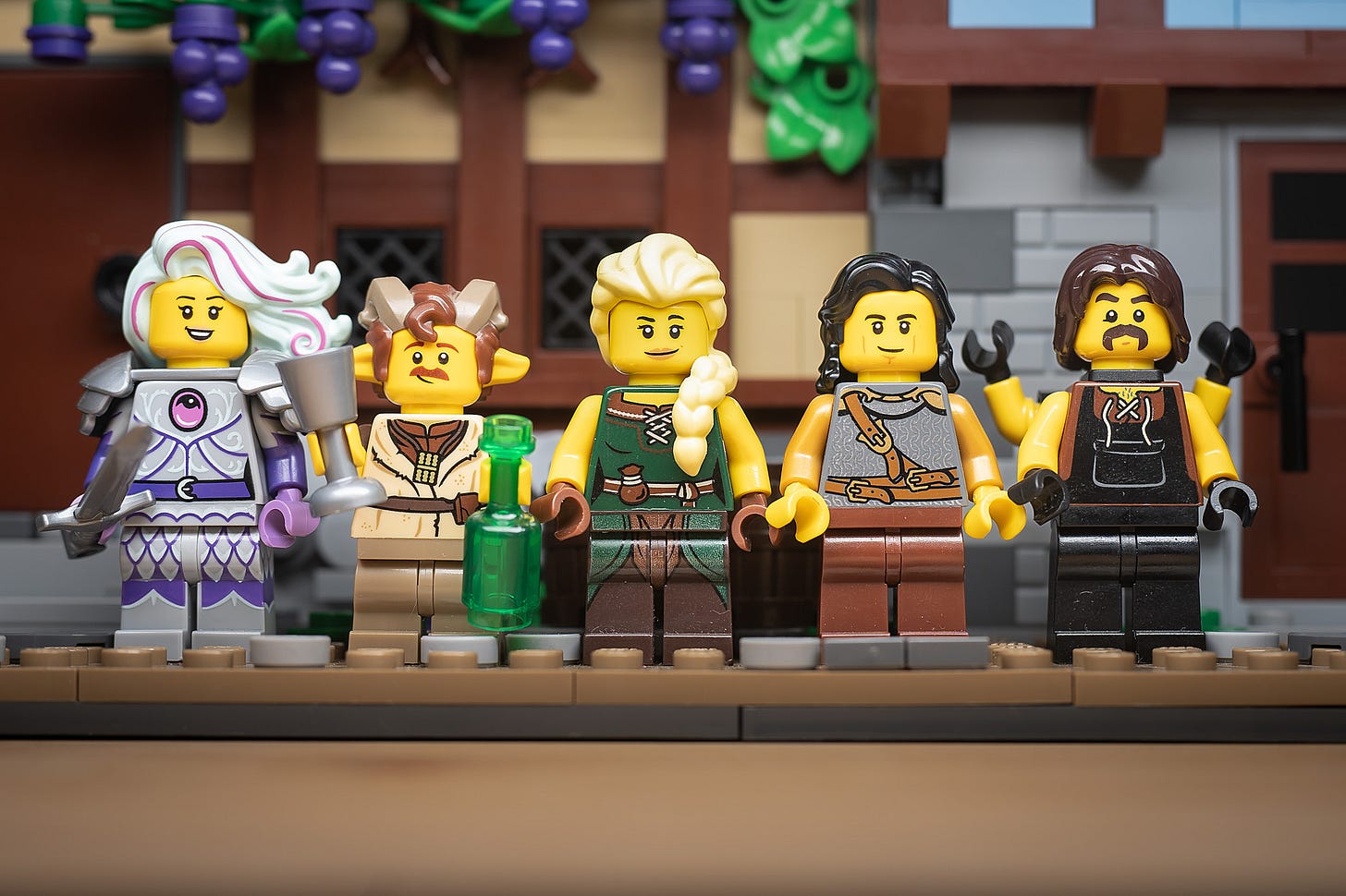
What you’re looking at above is in the top 5 of my most-liked posts on Instagram in the past year.
It’s a bit surprising, maybe? There’s no interesting lighting, no “story” as such, no practical effects—there’s nothing of my photography style there at all. What does shout “Four Bricks Tall made this” are the custom medieval fantasy characters that I’m known for in the community (I’ve made over 80 by now).
But otherwise, this photo is exactly what you see: a bunch of LEGO minifigs in a row, a composition known affectionately in the fandom as a figbarf.
Stylistically speaking, it’s an unremarkable, low-effort photo that took me all of 10 seconds to create. A literal snapshot. I just needed a lineup for a minifig design contest entry and that meant minifigs in sharp focus and even lighting. Done and done.
Yet it sits as one of my most popular posts across several metrics like reach, impressions, saves, and likes, according to Instagram Insights.
Many toy photographers might be annoyed that something as pedestrian as this can gather such attention from people, but I’m not. I get it.
I realized some time ago that nobody goes to Instagram to see art. They don’t launch the app to get inspired, learn something, or whatever it is Adam Mosseri says we show up for.
We open Instagram because we’re bored. We just want to be distracted for a few minutes. There are no deep thoughts when we’re in this mindset and we don’t really want to invite any.
And that’s precisely why that snapshot did well.
It’s not art—it doesn’t challenge the brain. It’s easily recognizable, instantly understandable content that effectively distracted for a moment and therefore, was a winner on Instagram.
People like LEGO minifigs, there were clear minifigs in the post, so people liked the post. It’s that simple.
Moreover, it's the novelty that draws—these characters I make are unique in that you can’t just buy them in a blind bag or a set. You’d have to have a deep affinity for LEGO minifigs and a big collection of parts to do what I do. It’s a hobby in itself for me.
Plus you’d have to be willing to pull out arms and legs that can cause breaks and cracks if you aren’t careful, and that signals risk.
I’ve shared this conclusion with several people in private chats and replies before, and each time it was a big revelation to them. An a-ha moment. But it was also met with mixed feelings of relief and dejection.
Relief because it makes sense: people like posts for the subject matter. I mean, look at all the cat pics everywhere.
Dejection because a new doubt arises: are people only liking my art for the subject matter too?
Yes, of course! I’d wager the vast majority of people who follow me on Instagram are there for the LEGO subject primarily, not my stylistic treatment of them.
In fact, sometimes it’s my stylistic treatment that makes the LEGO minifig less obvious—anathema on a platform like Instagram that rewards simple messages.
Simple photos, simple gardening tips, and simple cleaning hacks all do very well on Instagram. They motivate casual viewers and beginners because they say “Hey, it’s so easy, you can do this too!”
Accepting that people like our work for its subject alone could be humbling, but I think we all know this on some level. Who hasn’t speculated about others shooting Marvel, Star Wars, Harry Potter, or whatever popular IP in order to pander to those huge fandoms?
BTW, that holds true for LEGO photographers too: LEGO is just one giant IP. The minifigure in particular is an icon—a vigorously protected trademark, at that. We attract LEGO fans of all ages by simply sharing images of the toy, whatever the effort involved and whatever our intention (enjoying the IP or targeting an audience).
Even now as I write, there are stunning AI-generated images of toys popping up all over Instagram, racking up likes, and getting "great photo [insert 3 emojis, probably fire]" comments from people who apparently don’t know what a photo is anymore.
I’m not saying that that type of content is bad—I think it’s art but not a photo, that’s for sure. But I’m on an app designed to distract and that’s what these AI-generated images (again, not photos) do. What prompt will they think of next? Entertain me, and quickly, for I am bored.
Part of the problem lots of toy photographers have with their artistic work co-existing with other content on social media is that they’ve read the room wrong— Instagram isn’t an art gallery for the discerning, it’s an entertainment hub for the masses.
So why bother creating expressive and considered photos at all if they'll just perform poorly against low-effort content? Why not pump out minifig lineups from here on out?
I'm over 10 issues into this TBTP thing so you should know the answer by now: it's about the process, not the result. I don’t think shooting minifig lineups is rewarding and I don’t care about winning internet points from bored strangers.
I deeply appreciate when someone I admire likes my work though, let’s be clear.
I have to say at this point that I was hesitant to write this essay because I might inadvertently be giving people ideas on how to game Instagram and other social media.
Here’s the thing though: you’d have to keep putting out pandering, low-effort content regularly for as long as you can take it. Then when you can’t anymore, you’ll burn out and somebody else with that same game plan will take your place in a scroll-swipe.
Worse still, no one will even notice you’re gone because your work was always just Insta-fodder.
The Instagram graveyard of inactive accounts is littered with unremarkable, lookalike creators who got used up by the platform. I tried coming up with an example but I couldn’t remember any of their usernames lol.
Likes and follows on social media aren’t a measure of talent or quality and never will be. Because social media isn’t an art exhibition in the first place, it’s a bottomless distraction pit where the easiest message wins.
Toy Photography Tips
In this issue, I’m going to share how I think about lighting and point out a not-so-obvious mistake toy photographers commonly make when lighting their own photos: being too realistic with their lighting.
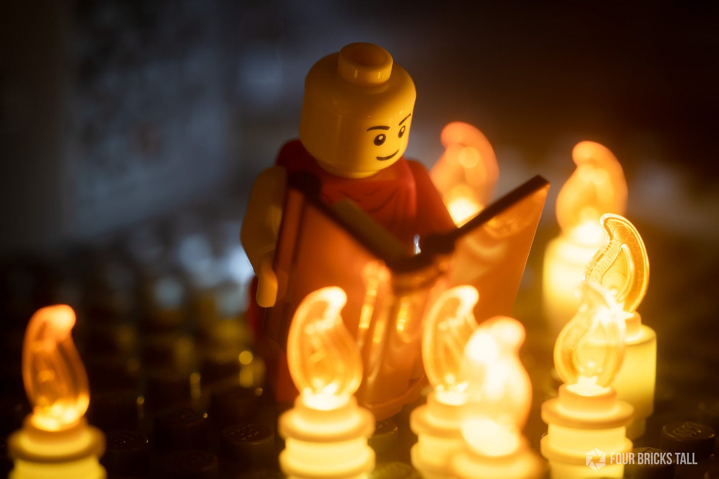
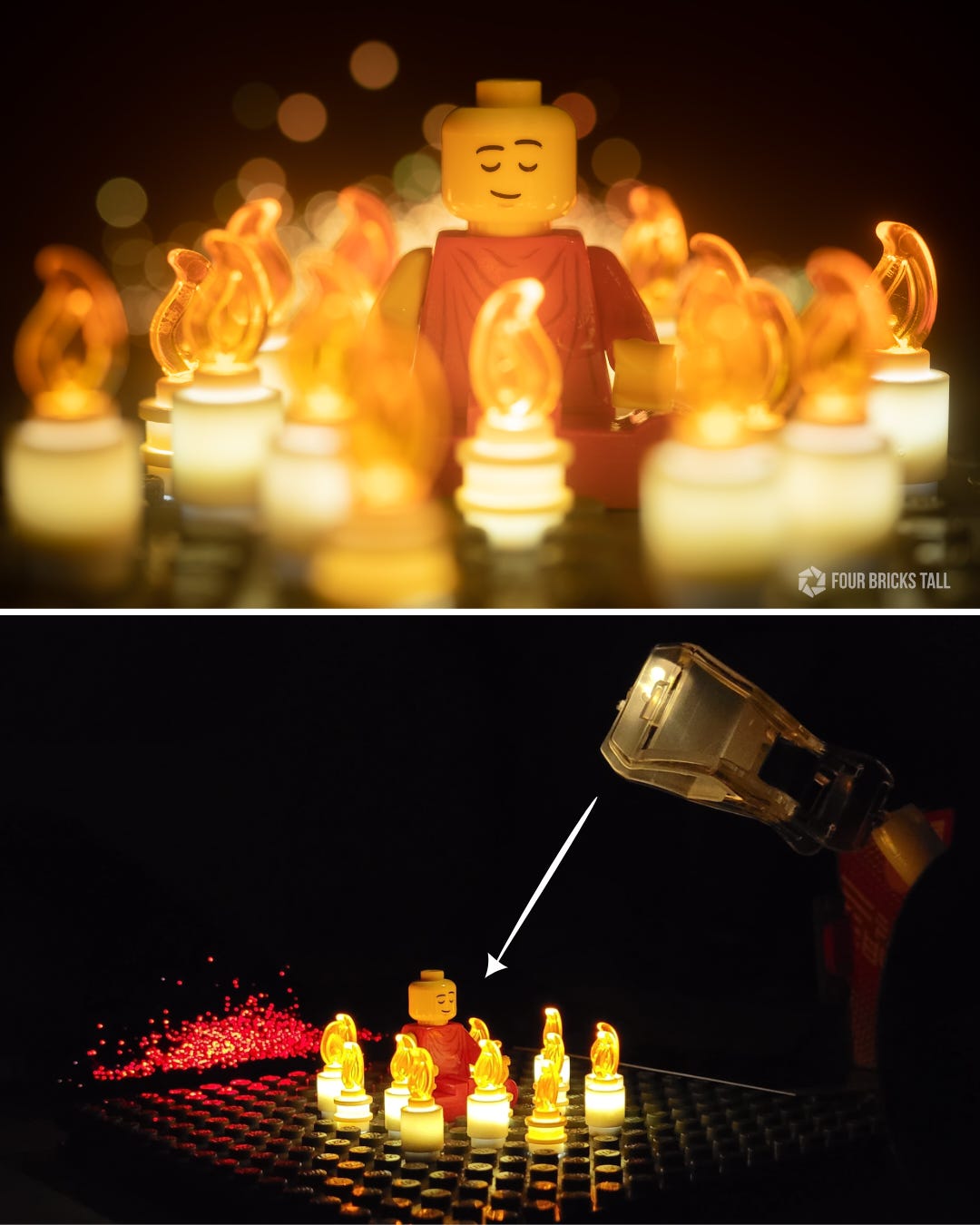
But first, a quiz: how many lights did I use to create this photo?
If you answered 8, you’re just counting the candles. Wrong.
If you answered 9 because you saw that light behind the monk, nice catch! But still not quite there.
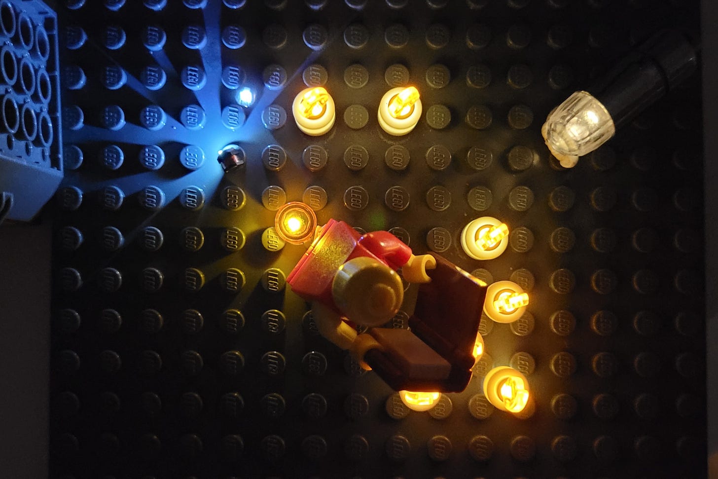
The answer is 12— 8 candles, 2 bare LEDs behind the monk pointing at the background, 1 orange “gelled” LED directly behind the monk pointing up, and 1 balloon LED out of frame pointing at the monk’s face.
(Oh, you’re not going crazy, a candle is missing in the foreground because I was reconfiguring the scene when I took this BTS overhead photo so there are only 7 in there. And I’ll discuss these LEDs in a future issue— gear matters!)
Those 2 bare white LEDs pointing at the background create some separation between it and the subject. The white-bluish light helps the warmer-colored monk stand out more, carving out its shape from the background.
It also lifts details out of the shadow— you can see some texture in the background. Without the background lighting, everything behind the monk would go black which would make the scene look flat, with no depth.
Next, the LED covered by a transparent orange tile directly behind the monk was placed there to suggest more candlelight reached that area.
Finally, the balloon LED camera right illuminated the face of the monk, a focal point, which would otherwise be underexposed if only lit with practical candlelight. That’s called “motivated lighting” in the world of cinema.
Motivated lighting is when you use light sources to enhance or imitate a light source within the scene.
That might sound like a lot of unnecessary lights for the concept of a monk reading by simple candlelight. But if I were to go about that literally, I’d end up with a pretty meh photo.
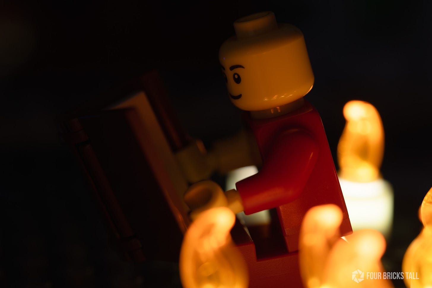
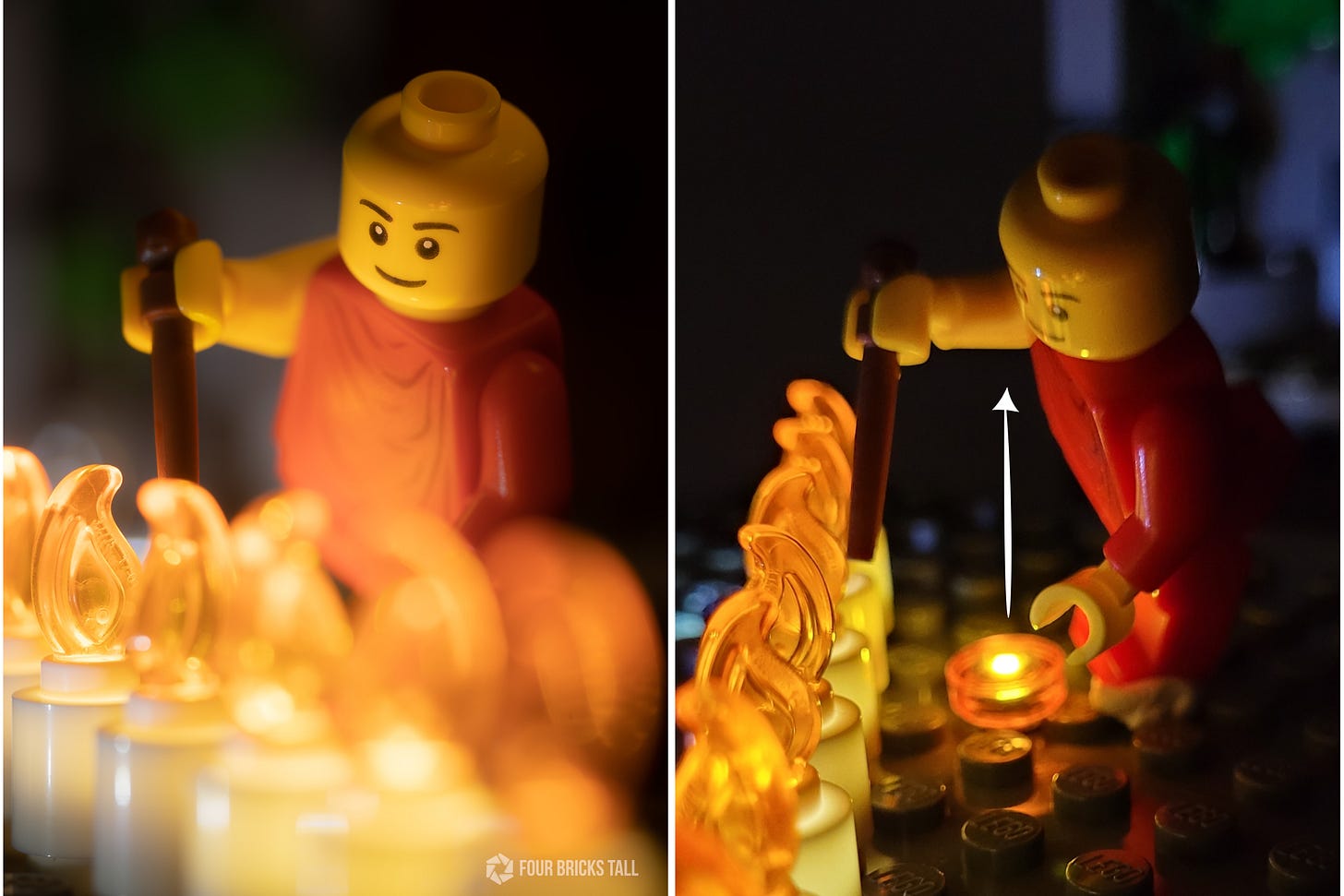
To illustrate, here’s an earlier test shot taken at a different angle with just the candles lighting the scene:
Now it becomes really apparent what the additional lights did for the other photo. In this one, the candles register clearly and the subject is legible, but I can’t even make out the book or where this might be happening. It’s realistic lighting, not stylized.
I used a similar stylized lighting approach in this photo where I lit the background just a little bit and added a LED at the feet to motivate the candles:
Off-camera, I used the balloon LED to light the monk’s head from behind to carve out its shape.
Slightly different, I used fiber optic lights in the background as the practical lights and pointed a balloon LED at the monk:
The point is to think like a cinematographer who uses stylized lighting for storytelling purposes.
Don’t be too literal with your lighting, trying to make it match what your eyes see. It’s a mistake I see toy photographers make over and over again.
Lighting can be a technical aspect but just like everything else in photography, it has an artistic aspect as well. That doesn’t mean you have to depart from reality when lighting, but take those creative liberties so long as they serve the scene and don’t call attention to themselves.
Having said that, I could have done a better job diminishing that hotspot behind the monk by moving or raising the LED a bit more, but it still served the scene well by separating the subject, giving it shape, creating depth, and adding detail to shadow.
The reality of the lighting is less important if you’re trying to tell a story, and artistic choices don’t have to make perfect sense.
That’s the tip.
Toy Photography Features
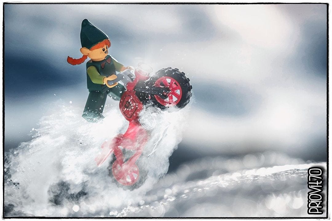
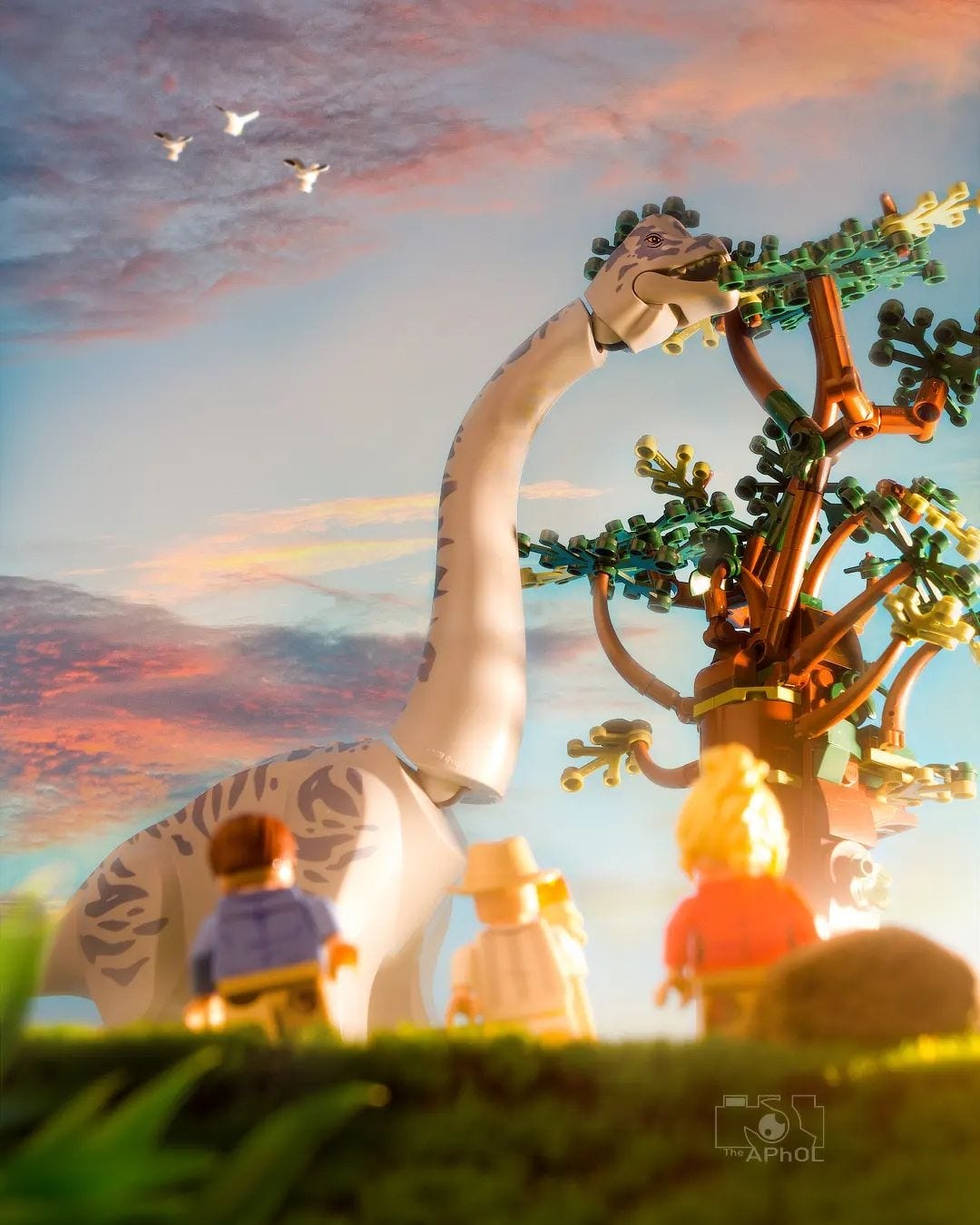
I’m going to be on the road to Italy for the next few weeks so I thought I’d highlight some of my favorite Italian LEGO toy photographers.



That last image of the monk amidst the candles is fantastic; I love it for the art and the time it took to create with light. The mini figure is awesome too, not just because I love minifigures but it’s a monk! Anyhow, I digress.
The photoblog community that was destroyed by social media was all about the art and being a better photographer. I used to be a part of that community before it dissolved and dissipated to IG. When IG came out it was about the art; the realistic filters for photos designed by professional photographers to enhance even mundane photos and make them look more awesome.
I feel like as time went on more and more folks joined IG and the “photographic” community purely for extrinsic motivations. I, along with many other photographers were intrinsically motivated to shoot better photos. Intrinsically meaning inside; no need for external motivations like likes and shares and saves and clicks and comments. But when IG was purchased by FB it was apparent that FB wanted to push extrinsic motivators on to everyone because it made the platform more broad reaching outside of photography and the photoblog communities IG had replaced.
There are plenty of researched articles and journals on the subject of motivation. These studies found that most of the time when extrinsic motivators are introduced, it killed intrinsic motivation almost immediately. Like having my kids do the dishes because they love to be part of our family and help out around the house (intrinsic); yet when I pay them to do it (extrinsic), all of the sudden they put a monetary value on the action and decide it’s not worth it.
I feel there are many extrinsically motivated folks that come and go because IG was built on the foundation of Intrinsic motivation at its roots. I also think that’s why it’s so hard for photographers that are intrinsically motivated to see the platform de-evolve into something so basic as extrinsic motivation. But it’s a real thing and it is what it is. So I agree there that if it quacks like a duck and looks like a duck and flies like a duck then we should treat it and approach it like a duck. But I will still keep it intrinsic—because that’s what it is for me; I’m motivated to up my game because it’s fun and I enjoy the learning experience so thank you for writing this article. It’s true to form of the photoblogs of yesteryear.
This is so interesting! Always wondered why the “figbarf” 🤣 photos do so well!